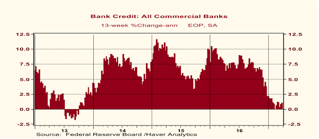
Goldman’s Mr. Hill hypothesized that the recent weakness in bank C&I loan growth was due to the re-opening of the bond markets to oil and gas industry borrowers. According to Mr. Hill, when energy prices fell in 2015 and 2016 (obviously due to the anticipation of a Trump administration that would promote oil/gas exploration and the elimination of environmental regulations), oil and gas producers had to tap their bank lines of credit because bond-market lenders became more wary. According to Mr. Hill, then, the recent weakness in bank C&I loan growth is largely attributable to a more receptive bond market toward oil and gas industry borrowers and does not signal an imminent slowdown in U.S real GDP growth from its blistering Q4:2016 annualized pace of 2.1%.
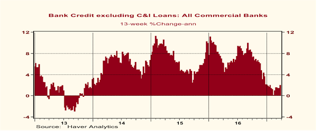
And I agree with Messrs. Duy and Hill that the recent slowdown in bank C&I growth is not alarming with regard to the future course of U.S. economic activity. But I believe bank C&I loan growth is a red herring with regard to the future course of the economy. Instead, I focus on the growth in bank credit excluding the C&I loan component. And as I mentioned at the outset of this commentary, growth in bank credit ex C&I loans also has weakened precipitously starting in December 2016.
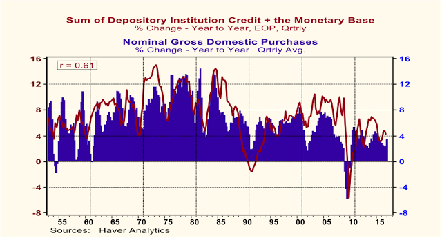
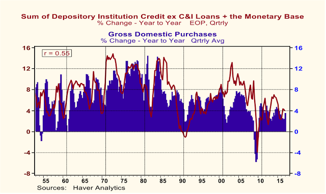
I am arguing that thin-air credit growth (you knew it was coming) excluding C&I loans is a better leading indicator of the pace of domestic demand than is thin-air credit growth including C&I loans. I will demonstrate this to you by comparing changes in correlation coefficients when thin-air credit leads and lags growth in domestic demand. Plotted in Chart 5 are year-over-year percent changes in quarterly observations of the sum of depository institution credit (including C&I loans) and the monetary base (the sum of depository institution reserves at the Fed and currency) along with year-over-year percentage changes in quarterly observations of Gross Domestic Purchases. The contemporaneous correlation coefficient between these two series is relatively high 0.61. (Remember, a perfect correlation is 1.00). Plotted in Chart 6 is the same thing except that C&I loans are excluded from the thin-air credit growth aggregate. The contemporaneous correlation coefficient between growth in thin-air credit growth excluding C&I loans and growth in Gross Domestic Purchases is 0.55 – not bad for private-sector analysis, but less than the 0.61 correlation coefficient when C&I loans are included in thin-air credit growth.
Chart 5
Chart 6

Remember, though, I am trying to discern which measure of thin-air credit growth is a better leading indicator of economic activity – thin-air credit growth with C&I loans or excluding C&I loans. So, we need to see what happens to correlation coefficients when thin-air credit growth leads and lags Gross Domestic Purchases growth. Contemporaneous correlation coefficients tell us nothing about leading or lagging characteristics. Does thin-air credit growth “cause” Gross Domestic Purchase growth or vice versa? When thin-air credit growth including C&I loans is advanced by one quarter, implying that today’s thin-air credit growth “causes” tomorrow’s Gross Domestic Purchases growth, the correlation coefficient falls from 0.61 to 0.59. When thin-air credit growth excluding C&I loans is advanced by one quarter, the correlation coefficient rises from 0.55 to 0.57. Now let’s retard thin-air credit growth by one quarter, implying that Gross Domestic Purchase growth “causes” thin-air credit growth. When we do this, we find the correlation coefficient for thin-air credit growth including C&I loans is 0.61, the same as its contemporaneous correlation coefficient and higher than 0.59, its correlation coefficient when thin-air credit growth including C&I loans is advanced by one quarter. These changes in the correlation coefficient suggest that thin-air credit growth including C&I loans is a lagging indicator of economic activity. When thin-air credit growth excluding C&I loans is retarded by one quarter, the correlation coefficient falls to 0.51 compared to its contemporaneous level of 0.55 and its one-quarter-advanced level of 0.57. These changes in correlation coefficients suggest that thin-air credit growth excluding C&I loans is a leading indicator of economic activity.
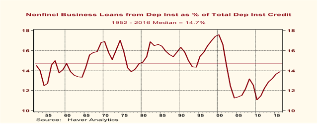
By the way, in case you think that there might not be much left of depository institution credit once C&I loans are excluded, take a look at Chart 7. From 1952 through 2016, the median percentage of nonfinancial business loans from depository institutions as a percent of total depository institution credit was 14.7. In 2016, C&I loans accounted for 13.9% of total depository institution credit. So, C&I loans, although a significant portion of total depository institution credit, are far from the whole ball of wax.
Chart 7
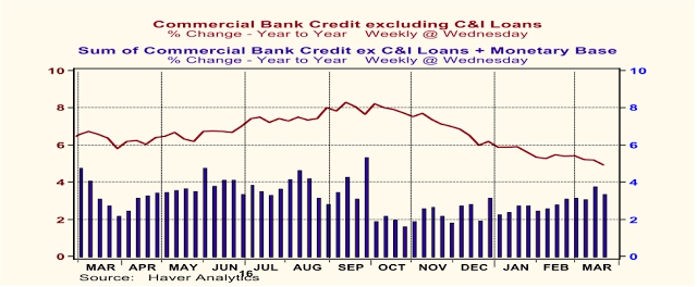
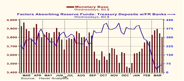
Okay, now that I have established (beyond a shadow of doubt?) that thin-air credit excluding C&I loans is the better leading indicator of the two, let’s see how it has been behaving on a year-over-year basis in recent weeks and months. This is shown in Chart 8. Although year-over-year growth in weekly observations of commercial bank credit excluding C&I loans has been slowing since October 2016, there has been some acceleration in the growth of combined bank credit ex C&I loans and the monetary base in recent weeks. Mind you, at 3.4% in the 52 weeks ended March 22, growth in this version of thin-air credit still is weak in an historical context. If commercial bank credit is not boosting modestly the growth rate of thin-air credit of late, it must be the monetary base. As can be seen in Chart 9, one important factor that has been increasing the monetary base since January is the decline in Treasury deposits at the Fed. All else the same, when these deposits decline, depository institution reserves increase. But as the April 15 tax payment date approaches, Treasury revenues will spike up. To the degree that these revenues are transferred to the Fed, all else the same, the monetary base will decline. In addition, when the Fed raises the federal funds rate, it has to reduce the supply of reserves in order to push up the interest rate. In sum, I would expect that in coming weeks the monetary base will be contracting. Unless there is a resurgence in bank credit growth, total thin-air credit growth will slow from an already tepid pace.
Chart 8
Chart 9
On January 17, I published a commentary entitled “
2017 – Shades of 1937”. In the commentary, I wrote: “Based on the recent slowdown in thin-air credit growth, I believe that a significant slowdown in the growth of nominal and real U.S. domestic demand will commence in the first quarter of 2017.” Perhaps “significant” was too strong an adjective, but I hold by my prediction of a slowdown in the growth of real domestic demand. Despite relatively strong employment gains in January and February and hinted at by the March ADP employment guesstimate, real GDP growth in Q1:2017 appears to have come in at an even weaker pace than that of the paltry 2.1% annualized in Q4:2016. (Perhaps the depths of the productivity labor pool are being plumbed, requiring a larger quantity of workers to get a given amount of output produced.) The Federal Reserve Bank of Atlanta’s
GDPNow Q1:2017 real GDP annualized growth estimate as of April 4 is 1.2%. Of course, this does not yet incorporate March data. Real personal consumption, which has accounted for about 68% of total real GDP in recent years, is coming in weak based on January and February readings. If the March level of real personal consumption were to be unchanged from the February level, Q1:2017 real personal consumption will have grown at an
annualized pace of 0.3% -- not 3.0%, but
0.3%. In order for Q1:2017 real personal consumption expenditures to grow at the 3.5% annualized pace of Q4:2016, March real personal consumption would have to grow at annualized rate of 9.75% vs. February. How likely is this given that from January 2010 through February 2017 there have been only two month when real consumption expenditures grew by at least 9% annualized month-to-month? The median month-to-month annualized growth in real personal consumption from January 2010 through February 2017 has been 2.3%. If March real personal consumption were to grow at an annualized 2.3%, this would imply Q1:2017 real personal consumption growth of only 1.1%. What is arguing against a strong reading of Q1:2017 real personal consumption growth is the annualized 17.1% Q1:2017
contraction in unit sales of light motor vehicles, the largest quarterly contraction since the 30.2% contraction in Q4:2009, the quarter after the federal “cash-for-clunkers” program that boosted motor vehicle sales.
In conclusion, with or without C&I loans, thin-air credit growth remains weak. Weak thin-air credit growth implies weak growth in domestic demand. If the Fed does raise its federal funds rate target a couple of more times this year as it has indicated it might, this would weaken thin-air credit growth further and would likely bring on a recession. My bet is after seeing the weakness in Q1:2017 real GDP growth and the lack of rebound in early Q2:2017, the Fed will hold its fire.
Paul L. Kasriel
Senior Economic and Investment Advisor
1-920-818-0236
“For most of human history, it made good adaptive sense to be fearful and emphasize the negative; any mistake could be fatal”, Joost Swarte
Monday, March 6, 2017
March 6, 2017
Do You Want to Restore Manufacturing Employment? Smash the Robots!
There has been much public discussion about the demise of U.S. manufacturing jobs and policies to restore manufacturing employment. Indeed, as shown in Chart 1, in absolute as well as relative terms, U.S. manufacturing employment has declined in the post-WWII era. In absolute terms, U.S. manufacturing employment started falling precipitously in the 2000s and has been especially hard hit since the Great Recession. (Shaded areas in this and subsequent charts represent periods of economic recession.) U.S. manufacturing employment relative to total U.S. nonfarm employment has been trending lower throughout almost the entire post-WWII era. While relative manufacturing employment has been trending lower for almost 70 years, manufacturing’s relative contribution to total real GDP (see Chart 2), after ebbing during the 1980s and early 1990s, staged a resurgence in late 1990s until the Great Recession. Although foreign trade is being advanced by some as the reason for the secular decline in U.S. manufacturing, I will argue that technology is the principal factor accounting for this phenomenon.
Chart 1
Chart 2
Let’s examine the relationship between U.S. net exports of goods and manufacturing output relative to total output. Plotted in Chart 3 are annual averages of U.S. real net exports of durable goods (real exports of goods minus real imports of goods) as a percent of total real GDP and annual averages of real GDP value-added of manufacturing as a percent of total real GDP. U.S. manufacturing output relative to total real GDP reaches a post-WWII low in 1981 and climbs back to its highest level since 1972 in 2006. Notice that as U.S. manufacturing relative GDP was oscillating higher from the early 1980s through the mid 2000s, the U.S. real net exports in durable goods relative to real GDP was oscillating lower. For historical reference, NAFTA was signed in 1994, the U.S. joined the WTO in 1995 when it came into existence and Mainland China joined the WTO in December 2001. So, U.S. manufacturing started making greater contributions to total GDP after NAFTA and after Mainland China joined the WTO. That is, U.S. manufacturing started making greater contributions to total GDP as the U.S. trade deficit in durable goods was enlarging up until the Great Recession.
Chart 3
So if foreign trade deficits are not a satisfactory explanation of the secular decline in U.S. manufacturing employment, what is? A secular increase in manufacturing-worker productivity. The data in Chart 4 compare the real GDP value-added of manufacturing per manufacturing employee, a crude measure of manufacturing-worker productivity, with the total number of manufacturing employees. Both series are converted to index numbers with their respective 1950 values set equal 100. If manufacturing workers are becoming more productive over time, that is, as time progresses, one manufacturing employee is able to produce a greater real value of manufacturing output than in previous years, the index number of the real GDP value-added of manufacturing per manufacturing employee would be higher. In fact, in 2015, this index number stood at 776. This means that a manufacturing worker in 2015 could produce 676% more output than she could in 1950 (776 represents a 676% increase vs. 100). This translates into a compound annual rate of growth in this crude measure of manufacturing-worker productivity of 3.25% from 1950 through 2015. The index number of total manufacturing employment in 2015 stood at 88, meaning that there were 12% fewer manufacturing employees then compared to 1950 (88 represents a 12% decline vs. 100). Given the secular increase in manufacturing-worker productivity, it is not surprising that there has been a secular decline in the number of people employed in manufacturing.
Chart 4
The data in Chart 5 help explain the secular increase in manufacturing-worker productivity. Along with the index of real GDP value-added of manufacturing per manufacturing employee, again a crude measure of manufacturing-worker productivity, I have added the index of the real net stock of business equipment per manufacturing employee – a crude measure of the capital-to-labor ratio in manufacturing. Give a woman a brace-and-a bit set, and she can drill more holes in a given amount of time. Give a woman an electric drill, and she can drill even more holes in the same amount of time. Give a woman a drilling robot to run, and she can drill yet even more holes in the same amount of time. In other words, the more equipment and more technologically-advanced equipment a manufacturing worker has to work with, the more output can be produced by that worker in a given amount of time. As the capital-to-labor ratio in manufacturing rises, so should worker productivity rise. And that is what the data plotted in Chart 5 indicate.
Chart 5
The moral of this story is that if America wants to restore manufacturing employment to its former glory, the federal government should form a search-and-destroy task force with the authority to enter manufacturing facilities in the U.S. to smash robots, computers and any other labor-saving equipment the deputized task force deems appropriate. Then there will be a tremendous increase in demand for U.S. manufacturing employees. Of course, manufacturing output will grow more slowly and the prices of manufactured goods will skyrocket. But, hey, the goal of increased manufacturing employment will have been achieved.
Paul L. Kasriel
Founder, Econtrarian LLC
Senior Economic and Investment Advisor
1-920-818-0236
“For most of human history, it made good adaptive sense to be fearful and emphasize the negative; any mistake could be fatal”, Joost Swarte
© The Econtrarian
Read more commentaries by The Econtrarian